

So, I will cheat and show the finished quilt top first, so those who have other things to do can just take a glance, and then get into the process.
The quilt is small, about 40" by 50" and it is Tula Pink Parisville in the Sprout colorway, sashed with Kona Snow. I am not sure what to call the design, as it is a little bit of a cobble-together.
I searched and searched for ideas about what I wanted to do with this quilt, looked all over the Tula Pink Flickr group for ideas, because I have never worked with big prints that seem to need to be showed off before. Finally I found this Flickr picture, but I do not know how to contact the person who made the quilt to give them credit, so hopefully this will suffice. Update: found the designer of this pattern by cruising Sew Mama Sew, via Quilt Dad: it is a Happy Zombie pattern called Rectangle Reverie.
This fabric is part of the Fat Quarter Shop winnings I received and was so excited to work with. I really like the way it turned out, but it was not what I planned.

I originally planned it to look like the quilt from the Flickr pic, but I sketched it out quickly before my son woke up one day and never referred back to the photo. So I made some notes on my original sketch, squashed a lot of numbers in, calculated what I would need to measure and cut, and then cut. I am impetuous like that, or spontaneous, or something that borders on impatient.


I wanted to share all this because the finished product looks nice (if I do say so myself) but I like what I have been seeing on others' blogs about process and showing mistakes or otherwise imperfect parts of beautiful quilts. So I am taking the process pledge and starting with that honesty now. I am a perfectionist at heart, but my way of sewing and quilting is a break from that, and my methods don't allow it!
Please see the button below for the pledge.
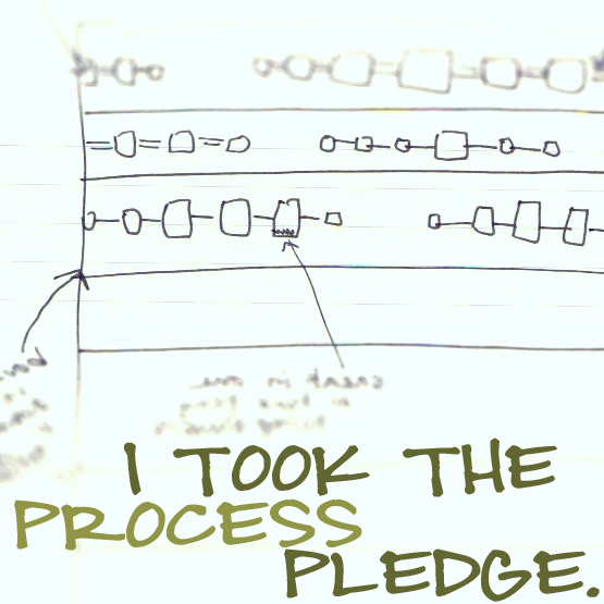 I, Amorette, pledge to talk more about my processes, even when I can’t quite put them in the in words or be sure I’m being totally clear. I’m going to put my thinking and my gut feelings out there.
I LOVE this one! I don't know if the fabric is brighter in person, but I like the earthy colors with some brighter ones mixed in. That is definitely one of those "mistakes" that no one ever would have guessed by looking at your final quilt.
ReplyDeleteI love that combination of fabrics (especially because I have a lot of that myself). I know you came up with the how to for this yourself, but it looks similar to the quilt from the Winter 2010 issue of Quilts and More called rectangle reverie. Just an FYI in case anyone else was interested. I think it's totally AWESOME anyway. How very cool that you were able to make your own from just looking at a picture. I'm making one very similar myself but with totally different fabrics. Thanks for sharing this and the process!
ReplyDeleteThat really is a great looking quilt! And I don't think anyone would ever look at it and think you made a mistake. We are usually our own worst critics! I also love it when people show their mistakes. People who do everything perfectly aren't nearly as fun!
ReplyDeleteGood for you - I think your quilt looks great!
ReplyDeleteI just love Tula Pink. This is a wonderful flimsy
ReplyDeleteIt looks really great, a good use of the larger prints.
ReplyDeleteI LOVE this quilt - particularly the thinner blocks of yellow which help the rest of the fabrics pop. AND... I think it probably looks better this way than having them all match up. Fantastic!
ReplyDeletelove the quilt. I took that pledge too. Means I have to fess up when I mess up, but that's okay. It's all part of the process!
ReplyDeleteHey there, I found you over at Lily's. This quilt looks beautiful but I also like everything else I see here. Love the colors you choose! Hope to hear from you. Sana
ReplyDeleteLove this quilt, the prints are lovely and I think the offset yellow rectangles show them off in a nice way - moreso than the 'perfect' geometry would have : )
ReplyDeleteOh it's beautiful! That's the issue I'm having - the large prints but you have showcased them beautifully!
ReplyDelete